Keurig Dr Pepper Canada

KDP's Bold and Dynamic Identity
The new Montreal offices of Keurig Dr Pepper (KDP) Canada were skillfully designed to reflect the company’s vibrant identity and its iconic products. The overall concept revolves around the bubble, symbolizing the duality between the refreshing energy of carbonated beverages and the comforting warmth of coffee.
This duality is expressed in the space layout, which places communal spaces at the heart of the work environment, itself divided into four distinct neighborhoods. This design fosters socialization by encouraging interaction and collaboration among employees.


Individual workspaces, strategically positioned at the corners of each floor, feature acoustic tile ceilings, ensuring a calm environment conducive to concentration. These zones, bathed with a soft and soothing atmosphere, invite both reflection and relaxation.
Inspired by contemporary design principles, the space offers unassigned seating and a flexible reservation system, allowing each employee to choose their own creative corner. This well-thought-out design creates a dynamic atmosphere where everyone can move freely while cultivating natural interactions between colleagues.
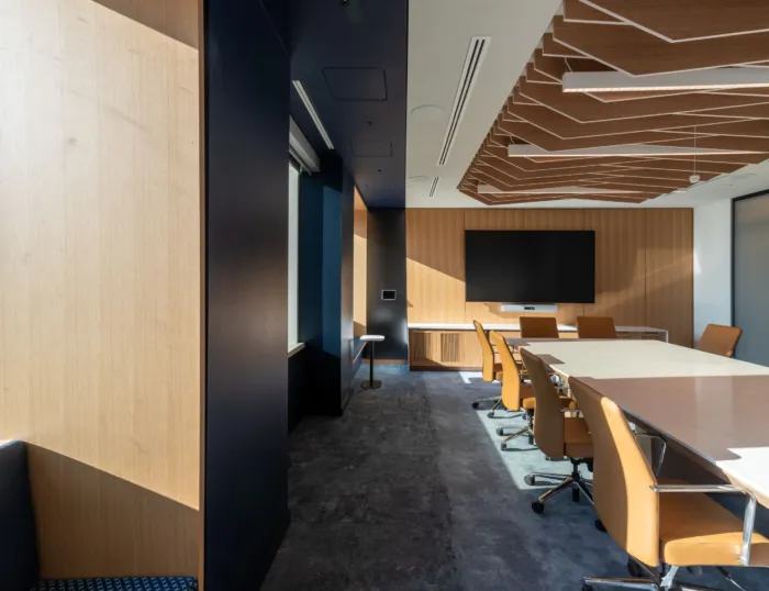
At the center of each floor, collaborative spaces are organized into dynamic hubs that invite interaction. Their colorful and playful design creates an ambiance conducive to the exchange of ideas. Meeting rooms are also equipped with acoustic finishes, ensuring optimal sound quality. Biophilia, a key element of this project, is integrated on all levels to establish a connection with nature and promote employee well-being.


The project stands out for its use of a vibrant color palette inspired by KDP's signature colors. Each floor is identified by contrasting shades: one floor blends green and pink, while the other incorporates hues of blue and yellow. This chromatic duality segments the workspaces while creating a dynamic and inspiring atmosphere, where each color contributes to a unique visual identity for each neighborhood.
A central backlit staircase links the three levels, evoking the movement of bubbles present in KDP beverages. Each floor is equipped with a café for quick breaks between meetings, all strategically located near the staircase.
On the ground floor, the cafeteria incorporates all the brand colors, creating a dynamic and friendly space where employees can gather. The reception area, in contrast, features a sober aesthetic, inviting visitors to discover the KDP universe as they explore the different floors.


Phase II: Expansion and Collaboration
The second phase will include the expansion of the space by 11,000 square feet, including a meeting room for 40 people, along with additional meeting rooms and a library. The emphasis will be placed on open areas and collaborative spaces, with an outdoor terrace complementing the offer.


Space Branding and Signage Design
The environmental graphic design concept draws inspiration from the creative direction of the interior design, highlighting duality, contrast, and bubbles. These elements, reminiscent of coffee foam and carbonated beverages, are translated into wall patterns used along circulation routes. Printed graphic murals and customized privacy films enrich this visual interaction. The various areas are identified by KDP's colors, a principle that forms a central element of the wayfinding strategy, complemented by the numbering of offices and rooms.
The signage, fully customized to reflect KDP's image, follows the established graphic direction, featuring identification, directional, and other circular-shaped signs. The pictograms also showcase curved shapes, in harmony with the overall aesthetic.
Meeting rooms bear names inspired by iconic neighborhoods of major Canadian cities, with each room being identified by perpendicular signs tinted in the colors of their respective neighborhood. This approach not only reinforces KDP's local identity but also fosters a sense of belonging among employees.


